Wednesday, 21 December 2016

Digi pack advert research : The Killers " Day & Age "


This advert for The Killers’ album Day & Age is particularly stylized, using the album art and stylistic font to catch the eye of the audience. The artists’ name is significantly large, taking up most of the top half of the page following the convention of a music add.

This is followed by the dark bold font of ‘Day & Age’, which highlights the name of the album. The bright bold font of the information at the bottom of the screen is contrasted by the black background, which in turn contrasts with the vivid color of the album art drawing the viewers eye.

The typeface used on the main image is the same as that used for the bands logo which is featured on everything from album covers to the websites. This focuses on the strong brand identity which the band have built up. The style of the typeface is also notorious of the alternative rock genre, which identifies with the target audience. However there is an underlying tone of a retro era - more of a sixties vibe in terms of the typeface itself. The font is also made up of the same pixels as the background image itself, which keeps the same texture running throughout the advert and looks aesthetically pleasing.


 The gutenberg design principle is put into effect here, with the artist’s name taking up a large part of both the primary optical area and the strong fallow area. Both the weak fallow and terminal areas at the bottom of the page are in black, drawing the reader’s attention to the top of the page where the most important information is, along with the bright and colorful artwork of the album.

The font choice that this magazine advert uses as the release date and information is extremely simple but is traditional in suiting the genre conventions. This font is a bold sans serif style font which although simple is very eye catching when used with the white on black color choices. This font also appears to have a fixed width which makes the space between lettering even and more aesthetically pleasing. Unlike most magazine adverts advertising a new album release, this one has no reviews on it from any big publishers, magazines or newspapers. This gives the impression that the band don't care what critics think but rather what you the listener thinks which seems to be a popular convention within this genre.

The gutenburg design layout

The Gutenberg Diagram
The Gutenberg diagram describes a general pattern that the eyes move through when looking at evenly distributed, homogenous (parts or elements that are all of the same kind) information.

The pattern applies to text-heavy content. Think pages in a novel or a newspaper or adds.

The Gutenberg diagram divides the layout into 4 quadrants.


  • Primary optical area located in the top/left
  • Strong fallow area located in the top/right
  • Weak fallow area located in the bottom/left
  • Terminal area located in the bottom/right


The pattern suggests that the eye will sweep across and down the page in a series of horizontal movements called axes of orientation. Each sweep starts a little further from the left edge and moves a little closer to the right edge. The overall movement is for the eye to travel from the primary area to the terminal area and this path is referred to as reading gravity.

Naturally this is for left to right reading languages and would be reversed for right to left reading languages.

The Gutenberg diagram suggests that the strong and weak fallow areas fall outside this reading gravity path and receive minimal attention unless emphasized visually in some way.

Important elements should be placed along the reading gravity path. For example placing logo or headline in the top/left, an image or some important content in the middle, and a call-to-action or contact information in the bottom right.

Designs that follow Gutenberg are said to be in harmony with natural reading gravity.

The claim is these designs improve reading rhythm, by being in harmony with the natural reading rhythm, as well as improving reading comprehension, but there’s little empirical evidence to support the claim.

I plan to use this and incorporate it into our add to emphasise certain parts of information

Digi pack research: Mumford & Sons "sigh no more"


Friday, 9 December 2016

2nd draft of advert

This is the second draft of the advert we have produced, we have changed the text , the images and really worked on trying to develop between synergy between it and the music video. We have even looked at it in different colours.

We got alot of feedback on these adverts and we found that people loved the different colours we had used and suggested maybe doing a bunch of adds in different colours. Other positives we found people liked about our add was the photos we used for it. We also got feedback telling us to make the album name more clearer as it was not obvious from a glance at it.


Tuesday, 6 December 2016

1st draft of advert


This was the feedback I got from flickr about my inital add I had made. I am going to improve my add by using their feedback to construct a better add.

Monday, 5 December 2016

Todorov

Lately I have been coming through narrative theorists and recapping them and I've noticed that mine and Caity's music video does not follow Todorov's theory fully. Todorov's theory states that all narratives start

  • in a state of equilibrium 
  • go into a state of disequilibrium 
  • end when a new state of equilibrium has been achieved.   
Our video right away starts in a state of disequilibrium and no state of equilibrium is achieved, leaving the audience without a complete story. 

Friday, 2 December 2016

Research: Bastille promotion package

Bastille (On digipacks written as BĪ”STILLE) are a British indie pop band formed in 2010. The group began as a solo project by lead vocalist Dan Smith, but later expanded to include keyboardist Kyle Simmons, guitarist and bassist Will Farquarson, and drummer Chris Wood. The name of the band derives from Bastille Day, which is celebrated on 14 July, Dan Smith’s birthday is also on this day and has admitted to getting inspiration and naming the band from this. Bastille have won several music awards and landed many nominations, including ones for Brit Awards, Billboard Music Awards, World Music Awards, and Grammy Awards. Bastille has sold over 8 million records worldwide. Across the band’s social media you get the sense that the band are also music fans first and foremost and that love of music is something they share with their fans.

In February 2013, ahead of the release of their debut album, the band's fourth single, Pompeii was released to huge demand, this is the song that brought Bastille further into the public eye charting at number 2 in the UK.  Their first studio album ‘Bad Blood’ was released in March 2013 and debuted atop of the UK Albums Chart.


There are no images of the band on the front cover, suggesting that the band’s ‘brand’ is not dependent on, or even linked to, their physical appearance. Also follows conventions of rock artwork – image is ambiguous, ‘arty’ and juxtaposed with red text and name of album has dark, sinister connotations.

Thursday, 1 December 2016

Rough cut 4


This is the latest version of our music video, there are many changes such as changing the colour's in flashback sequences and adding vignettes to to soften shot edges.

Monday, 28 November 2016

Actor issues

Luke, our male actor has changed his look after filming, shaving off his beard and changing his glasses and getting a haircut. This creates many issues for me and Caity as now we are in the dilemma of if we can reshoot anything or take new photo's Luke will look completly diffrent to how he looks in the video

Research: Active Audience

This idea (particularly associated with mass-media usage) that the audiences are not just passive containers for forced meanings but rather individual audience members who are aggressively (although often unconsciously) involved—both cognitively and emotionally—in making sense of texts.

This active involvement has several consistent proportions: perception, comprehension, understanding, evaluation, and response. Advocates of active audience theory claim that scholars cannot assume that the meaning of a text is fixed in advance of its reception because meaning is the product of a negotiation between the audience and the text in the context of reception. They argue that people use the media for their own purposes.

This newer model sees the audience not as couch potatoes, but as individuals who are active and interact with the communication process and use media texts for their own purposes. We behave differently because we are different people from different backgrounds with many different attitudes, values, experiences and ideas.

Saturday, 19 November 2016

Dave from blueprint coming in to teach us more advanced skills with Final Cut

On the 29th of this month we have one of the editors from the blue print film foundation called Dave coming in to come lead a workshop on editing with us, these are the questions I have to ask. I would like to ask those questions and learn to make better use of Ken Burns among other tools like transitions.

  • Can we make Luke fade out of shot ?
  • What do you make of our transitions ?
  • What do you make of the shot length of our montage shots?
  • What colours would look best emphasised on our video?
  • What do you think would improve it ? 

Friday, 18 November 2016

Planning: The hyperdermic needle theory

The hypodermic needle theory is entirely metaphoric- its first suggestion being that the different messages from the media are injected into the audience consuming them- it is powerful, and the audience cannot resist its effects.

The most alarming suggestion is that the media acts like a drug upon its consumers- hence the effect of the hypodermic needle. The audience is described as being drugged and addicted to the media which explains the fascination with celebrities personal life's for example.


Our music video 
This theory is relevant to our video as our message is about obsession and through our video we show that not being able to get someone out of your head is normal and happens to everyone. This theory tells us that people  would be powerless to our message and have to notice it.

Research: David Croteau and William Hoynes

David Croteau and William Hoynes suggested that the process of consuming media texts had a direct effect or influence upon its audience- however, this effect is often considered to be negative.

They also suggested that audiences are often powerless or passive to the effects that media texts have upon them. The power within the text often lies within its underlying message- it can often go unnoticed but effects many a person.

I believe this theory to be true with the underlying message of  media texts having the most effect, but I feel that it can be considered posotive if the producers are responsible and know what the message of their product is.


Group Planning Post: Music Company Logo

We started out with our initial logo drawings of  "Smash Records", below you will see how me and Caity have changed it over time.


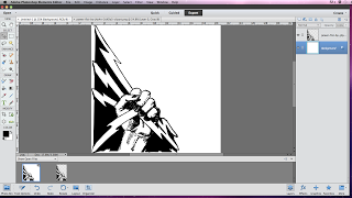
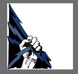
This is the first draft of the logo design for our own music institution, 'Smash! Records'. We have used a graphic image of a fist with lightening bolts which we found online, it was on a clip art website and Caity contacted the artist to ask their permission to use it. We created a new image on Adobe, made it square and then added the photo. Having it in one corner rather than the whole image, I feel is really effective and it looks like it really works well for the genre of music that we are making a video for. Next, I am going                                                                                     to choose a colour scheme that would work with                                                                                     the genre and also our music video.


This is the second version of the logo we have made. To choose the colours, I opened a photo from the photo-shoot we did for our digipak and used the colour picker tool on different items of clothing in the photo. The nails in this are painted green as common indie convention is for men and women to have their nails painted.


This is draft three of our institutions logo. This is where I have added text (the name of the institution). I feel like the font is really nice but I do not like the left alignment or the positioning of it as it makes the white space look very prominent and the logo just looks bare.


 This is the final draft of our logo for our Music Institution, the feedback from social media was very positive and people said that 'the colours and style represent your genre really well' and that 'this is a really powerful logo and it is so effective in promoting music in a professional presentation.'


Planning: Budget and above the line costs

 Above the line costs is used for matters related to the film's production budget, when we first started the project me and  Caity set a budget of £25 and were going to stick to it at all costs. For me and Caity filming our music video this was mainly

  • food
  • petrol
  • props

The only prop we had to buy for our video was a cup that was shamed to show Katie's anger at Luke in the video. This cup cost 1 pound as we bought it from a discount store know as "Bargain Madness".

To save cost's when we were filming on the first day we decided that we were going to walk to location mainly as we were filming in a local setting and everything was close together, this I credit for being the main reason we came in on budget. On day two of filming we were given a lift around by my nanna as we had some shots that were further away. We didn't have to pay for petrol thanks to her generosity this was another huge posotive helping us stick to the budget we had set.

The thing that cost us the most money was the food to feed our actors Luke and Katie. we spent roughly 20 pounds on pizza and food so we could thank them for helping us out with this project by making sure they were well fed.

COSTS
Food: £20
Props: £1

Total cost: £21

Rough cut 3


This is the latest version of our project, all the audio has been deleted off the clips and everything is sunk up to be in time with the music. We have also started to play round with fancier edits  , making some clips over cranked and montaging some shots. Me and Caity are both over the moon with how its turned out. we also made a shot longer and added vignettes to the shots over the argument shot that serve as flashbacks. This makes it more clear what they are instead of them just being there.

Planning: digipack draft 1

This is the first draft of our album cover, we have layed out our initial text and ideas for a colours we can use. The photo we are using for our cover features alot of colours and things going on such as leaves falling on the ground which makes choosing the colour of our text tricky as certain colours blend into it and make the text unreadable.


Thursday, 17 November 2016

Rough cut 2


This is the second edit of our music video, in this edit we made use of all these spare shots we had and started to play around with transitions to give it the feel of being a professionally edited music video. There are no longer any filler shots which is a positive meaning we are using our clips effectively. We are both happy with what our project looks like now and feel like it is heading in a better direction.

Tuesday, 15 November 2016

Planning: Reshoot failure

We have tried to contact our actors a few times to schedule reshoots but they have been unable to confirm any times or dates that they are able to come and reshoot the things that we wanted so today me and caity have sat and looked over all of our extra shots and have managed to edit the ones we weren't entirely sure about to make them into shots that ended up being really effective so we no longer need to reshoot.

Monday, 14 November 2016

Planning: Reshoot Details

We have planned the re shoots that we need to do, whether it be extra shots we have planned as filler shots or re shooting cuts that we are not entirely happy with. The shots we have planned for our second shoot are...


  • Re shooting the first scene in the bedroom and changing it to an over the shoulder shot.
  • Shots of the sun setting over the Humber bridge.
  • Shots of clouds.
  • Katie walking away.
  • Possibly a shot of some money.
  • Extra performance shots.