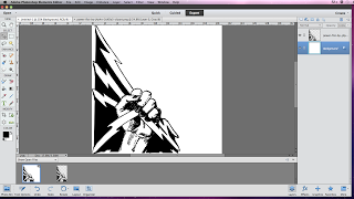
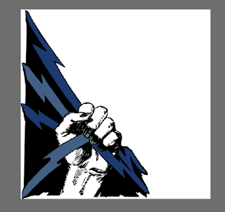
We started out with our initial logo drawings of "Smash Records", below you will see how me and Caity have changed it over time.
 This is the first draft of the logo design for our own music institution, 'Smash! Records'. We have used a graphic image of a fist with lightening bolts which we found online, it was on a clip art website and Caity contacted the artist to ask their permission to use it. We created a new image on Adobe, made it square and then added the photo. Having it in one corner rather than the whole image, I feel is really effective and it looks like it really works well for the genre of music that we are making a video for. Next, I am going to choose a colour scheme that would work with the genre and also our music video.
This is the second version of the logo we have made. To choose the colours, I opened a photo from the photo-shoot we did for our digipak and used the colour picker tool on different items of clothing in the photo. The nails in this are painted green as common indie convention is for men and women to have their nails painted.
This is draft three of our institutions logo. This is where I have added text (the name of the institution). I feel like the font is really nice but I do not like the left alignment or the positioning of it as it makes the white space look very prominent and the logo just looks bare.


No comments:
Post a Comment