Joe Shepherd A2 Media Music Video
Thursday, 9 March 2017
Note to the moderator
Hello, my name is Joseph Shepherd and I am an A2 media student at Brigg Sixth Form. I have blogged the entire journey of my music video and ancillary products, from my initial ideas to my final video. I tried to make my creative journey as clear as possible, labelling which posts are research and which posts are planning. In total, I have 132 posts on my blog, including my note to moderator, 4 evaluation questions, my music video, digipak, advert and other promotional media. Leaving 123 research and planning posts. Of the 123 posts, including 65 planning posts and 58 research posts. I hope you enjoy my blog, thank you!
Tuesday, 14 February 2017
Question 1 evaluation
Joe and Caity - media Script
2 seconds
Joe – To add the required freeze frames to our video we have had to remove some transitions as the transitions didn't work with the freeze frames. We opened our video with a high angle shot of one of our stars Katie asleep, to create empathy for her as she looks vulnerable. This makes the audience feel as if they have seen something intimate that they shouldn't of seen and makes them wonder what’s going on in the music video this creates an active audience.
Caity- This breaks convention as traditionally at the start of the video the star has a close up looking into camera so the audience can tell who the video is about but we chose not to adhere to this. The shot of Katie asleep works well in creating a narrative and our TA research confirmed that they approve of the shot making our music video appeal to a modern audience.
10 seconds
Joe- The shot of Katie left of frame at the Humber Bridge breaks up the shot of her asleep and shows the video starting in disequilibrium. This adheres to Todorov’s narrative theory which states how a narrative starts in equilibrium goes into disequilibrium and finally ends back in equilibrium. We chose to start in Disequilibrium as we felt it would create a griping narrative from the start.
15 seconds
Caity- We decided to have our video adhere to Barthes theory of an enigma in our narrative, this is achieved through the ambiguity of whether Luke is actually there or if he’s been imagined, it is shown through the desaturation of shots . The centre frame close up of Luke established him as a star.
Joe- This is quite conventional for music videos as the form is limited for example mine and Caitys only lasts 4 mins 25 seconds. By inserting an enigma into the narrative ,this leads the audience to have an active part as this enigma is never answered so it is left open to interpretation creating an active audience.
26 seconds
Caity- Cutting to the same shot but a slightly different angle allows an overview of the mise en scene and the location, Cutting on the beat to the same shot furthered the representation of a dream.
30 Seconds
Joe – Having Luke wake up Katie develops the dynamic of the relationship because she looks bewildered and anxious to see him. By dressing him in black we attempt to communicate to the audience that he is not really there with her. Katie's reaction also highlights that something has gone wrong in their relationship. The relationship narrative is a conventional narrative in music videos.
45 Seconds
Caity – We decide to use an under cranked shot of a cup smash to match the lyrics “Drives you mad” Goodwin states to meet conventions that lyrics must match visuals. This also represents Katie’s inner distress
52 seconds
Joe – We used photos overlaid with the video to show that there were positive times in the relationship to juxtapose what has just been seen. This montage was relatively successful and developed conventions, upon reflection we could furthed this in a greater variety of shots.
55 seconds
Caity – We had issues trying to schedule a reshoot so we used ken burns to help turn shots of Katie singing into close ups as this is a key convention when promoting a new artist.
1:02
Joe- We used the shot of Katie coming down the stairs and out the door as continuity editing
(Stop at 1:04)
This gives the sense of it being just a day in her life. Luke following her out the door builds the representation that her problems follow her wherever she goes. This relates to Vernallis diegesis as the action in the video communicates the meaning of “It’s normal to obsess over people who aren’t in your life” to the audience.
1:13
Caity – The next shot is a high angle ken burns close up of Katie singing into camera. This shows her as vulnerable and innocent. This adheres to Goodwin’s convention of singing into camera.
1:23
Joe – We cut on the beat to an extreme close up of a phone with a text saying “I’ve never been so happy” to flashback to the happier times in the relationship. This links to Allan Cameron’s Anachoric modular narrative due to our use of flashbacks in the video to show their relationship in a different time period.
1:25
Caity- Here we have the first recurring shot in our video with them walking together. We use this location multiple times in different stages of their relationship to show detrition. This also relates to a modern audience. Neale states “Repetition and difference” which applies here as we used the conventions of the indie genre to establish it as an indie video and then added in techniques like montages and repeating locations to make it stand out to the audience.
1:31
Joe- This then cuts again on the beat back to an extreme Ken Burns of Katie singing “you’ll know” into the camera creating a relationship with the audience.
1:41
Joe- We used a conventional extreme close up of a phone with a text saying "Cant make it" to further the disequilibrium we established earlier in the video. This links to Williamson cultural signifiers as we love in a culture where everyone has a phone an sends up to hundreds of texts a day, this makes our video more relate-able to a modern day audience. McDougall stated that it is getting harder to determine a media audience as an identifiable group so we addressed this by making sure we applied to an equal split through using both a male and female star.
1:43
1:45
Caity - Here we have the second use of the wooded path in a long shot of the two of them, this time with them not holding hands and they look awkward to show they has been a disagreement in the relationship. One convention of the indie music genre is that it is characterised by being presented in a unique way by repeating shots and changing the circumstance this is our way of following this convention.
1:52
Joe - This shot shows a happier place in the relationship. Luke is the main focus in the shot. He is presented as the powerful one in the relationship. This is a traditional representation as male characters are always represented as either having power or being power hungry in narratives.
1:57
Caity- Next we have an over the shoulder shot of Luke and Katie in the park, She goes to kiss his cheek but he pulls away. This shows how he is not as interested as she is. This follows the narrative conventions of narratives similar to ours as the boy is the one who is represented as not being into the relationship while the girl is.
2:00
Joe - This fades to the third use of the long shot of them walking down the wooded path, this time they are arguing and are clearly showing how the relationship has broken down and become bad. By repeating the same location it draws focus to the actors actions, this repeating of a shot the third time goes against the conventions of the music video, we repeated it for a third time as we felt it would really help pull focus to how broken down their relationship has become.
2:07
Caity - By repeating the cup smash in reverse it communicates the theme of dreams , makes the video more surreal and abstract as well as challenges the conventions of traditional music videos as it presents the audience an enigma to figure out " If this is really happening". The use of digetic sound challenges traditional music video conventions as the only sound we hear normally is the sound of the track.
2:08
Joe - By having the medium right of frame shot of Katie on the platform it shows the relationship of the two characters and con-notates that Katie gives more in the relationship than Luke as she is the one waiting for him checking her phone this furthers the relationship of Luke not being into the relationship
2:23
Caity- The montage of text messages Link's to Barthes Symbolic code as the text messages are representative of the modern day relationship as more relationships not take place online over face to face.
2:27
Joe - The two shot of Katie and Luke, where Luke pulls away from Katie kissing him makes look the villain in accordance to the theory of Vladimir Propp as well as furthering the idea of Luke not being into the relationship and that the relationship is breaking down. This adheres to the conventions of our narrative as the male is represented as not being into the relationship, if we wanted to challenge conventions then we would of had Katie not be into the relationship.
2:31
Caity - This low angle close up of Luke makes him seem taller and had more power creating a representation of Luke being a powerful and dominant figure. Since you can apply Propps theory to our video as Luke is the villain having him be represented as big and powerful helps make the audience see him as more of a villain.
2:34
Joe - We repeat the wood land path shot for the last time here to really push and demonstrate the representation that this is a damaged relationship by having Katie storm off. We have have visuals match the lyrics here as on the lyric " Thunder only happens when its raining" we added a rain filter in post production on final cut pro to do this. This adheres to Goodwin's theory of lyrics matching visuals.
2:44
Caity - The lyric "Women only love you when their playing" is matched here as well with the medium close up of Katie laughing as it shows she is in a good mood . This shot also makes the audience feel sorry for Katie as we see how her relationship is going bad but by having her laugh it communicates how innocent and vulnerable she is. This adheres to our narrative conventions of " Relationships" as the girl is the one who is vulnerable.
2:49
Joe - the extreme close up of the text reading " We need to talk" emphasises the fact that their relationship is coming to end, and shows disequilibrium in todorovs theory
3:01
Caity- By having this flash back to the bride area communicated to the audience in black and white in makes sure the audience know its a flash back and by having them act happy and as a good couple in this location it shows the audience that this was once a happy location for them both.
3:07
Joe - By repeating this location it juxtaposes the location and emphasis how bad the relationship has got. We reuse Barthes enigma code here as is Luke really there? or is this Katie dealing with her issues and getting over Luke?
3:21
Caity - Over the top of this we have used flashback with a vignette mask to help highlight their rocky on and off again relationship, the vignette mask soften's the edges of the shot. We used the same colour palette that we used in the other flashbacks to communicate that this was a flashback. By having Luke be the one which walks off it builds the representation of Luke being the one with power in the relationship as he leaves her.
3:27
Joe- This close up of Katie singing in the wind helps communicate to the audience how emotional she is, the gradual tracking backwards shows the location with the grey clouds and how windy it is to the audience which furthers the representation of her being in an emotional state.
3:56
Caity- A small vignette of Luke is visible in the top left corner. This denotes the implications of trying to move on from someone who is no longer there.
3:59
Joe- As we come to the end of the video, we used a montage of flashbacks. To make it prominent that these are flashbacks, we used a dark filter over the top of them, we used fast paced, over cranked shots to show the break down of the relationship quickly
4:09
Caity - By having the shots cut on the beat it shows how quickly relationships can change, especially in modern times. This makes it so it will be relate-able a modern teenage audience.
4:16
Joe- By having the final two shots replicate the first two shots of the video, it adds another enigma about whether the whole scenario actually happened or whether it actually was all a dream as suggested by the song title. The video me and Caity have produced does not end in a conventional way, We as an audience expect a happy ending where we see the problems resolved however be not doing this we break that convention. This again allows the audience to become an active audience as the narrative becomes open to their interpretation and how they would like it to end
4:20
Caity- We used a fade to black to further the representation of it being a dream as it was a dream like effect. In the video tried to ensure that we adhered to a common music video conventions, However there was some we felt we should challenge for example at the end of the video having the narrative in a state of equilbrium.
4:20
Joe - In our video neither are wholly good or bad , we chose to represent them like this as in a topic like relationships is not always a case of good and bad or someone being the worse person in the relationship. We felt that this would be the best way to present them as then we wouldn't offend either gender.
Joe- We used a conventional extreme close up of a phone with a text saying "Cant make it" to further the disequilibrium we established earlier in the video. This links to Williamson cultural signifiers as we love in a culture where everyone has a phone an sends up to hundreds of texts a day, this makes our video more relate-able to a modern day audience. McDougall stated that it is getting harder to determine a media audience as an identifiable group so we addressed this by making sure we applied to an equal split through using both a male and female star.
1:43
Caity- We used a shot medium shot of Katie and Luke throwing leaves up in the air to break up the flashbacks and show the disruption in their lives
1:45
Caity - Here we have the second use of the wooded path in a long shot of the two of them, this time with them not holding hands and they look awkward to show they has been a disagreement in the relationship. One convention of the indie music genre is that it is characterised by being presented in a unique way by repeating shots and changing the circumstance this is our way of following this convention.
1:52
Joe - This shot shows a happier place in the relationship. Luke is the main focus in the shot. He is presented as the powerful one in the relationship. This is a traditional representation as male characters are always represented as either having power or being power hungry in narratives.
1:57
Caity- Next we have an over the shoulder shot of Luke and Katie in the park, She goes to kiss his cheek but he pulls away. This shows how he is not as interested as she is. This follows the narrative conventions of narratives similar to ours as the boy is the one who is represented as not being into the relationship while the girl is.
2:00
Joe - This fades to the third use of the long shot of them walking down the wooded path, this time they are arguing and are clearly showing how the relationship has broken down and become bad. By repeating the same location it draws focus to the actors actions, this repeating of a shot the third time goes against the conventions of the music video, we repeated it for a third time as we felt it would really help pull focus to how broken down their relationship has become.
2:07
Caity - By repeating the cup smash in reverse it communicates the theme of dreams , makes the video more surreal and abstract as well as challenges the conventions of traditional music videos as it presents the audience an enigma to figure out " If this is really happening". The use of digetic sound challenges traditional music video conventions as the only sound we hear normally is the sound of the track.
2:08
Joe - By having the medium right of frame shot of Katie on the platform it shows the relationship of the two characters and con-notates that Katie gives more in the relationship than Luke as she is the one waiting for him checking her phone this furthers the relationship of Luke not being into the relationship
2:23
Caity- The montage of text messages Link's to Barthes Symbolic code as the text messages are representative of the modern day relationship as more relationships not take place online over face to face.
2:27
Joe - The two shot of Katie and Luke, where Luke pulls away from Katie kissing him makes look the villain in accordance to the theory of Vladimir Propp as well as furthering the idea of Luke not being into the relationship and that the relationship is breaking down. This adheres to the conventions of our narrative as the male is represented as not being into the relationship, if we wanted to challenge conventions then we would of had Katie not be into the relationship.
2:31
Caity - This low angle close up of Luke makes him seem taller and had more power creating a representation of Luke being a powerful and dominant figure. Since you can apply Propps theory to our video as Luke is the villain having him be represented as big and powerful helps make the audience see him as more of a villain.
2:34
Joe - We repeat the wood land path shot for the last time here to really push and demonstrate the representation that this is a damaged relationship by having Katie storm off. We have have visuals match the lyrics here as on the lyric " Thunder only happens when its raining" we added a rain filter in post production on final cut pro to do this. This adheres to Goodwin's theory of lyrics matching visuals.
2:44
Caity - The lyric "Women only love you when their playing" is matched here as well with the medium close up of Katie laughing as it shows she is in a good mood . This shot also makes the audience feel sorry for Katie as we see how her relationship is going bad but by having her laugh it communicates how innocent and vulnerable she is. This adheres to our narrative conventions of " Relationships" as the girl is the one who is vulnerable.
2:49
Joe - the extreme close up of the text reading " We need to talk" emphasises the fact that their relationship is coming to end, and shows disequilibrium in todorovs theory
3:01
Caity- By having this flash back to the bride area communicated to the audience in black and white in makes sure the audience know its a flash back and by having them act happy and as a good couple in this location it shows the audience that this was once a happy location for them both.
3:07
Joe - By repeating this location it juxtaposes the location and emphasis how bad the relationship has got. We reuse Barthes enigma code here as is Luke really there? or is this Katie dealing with her issues and getting over Luke?
3:21
Caity - Over the top of this we have used flashback with a vignette mask to help highlight their rocky on and off again relationship, the vignette mask soften's the edges of the shot. We used the same colour palette that we used in the other flashbacks to communicate that this was a flashback. By having Luke be the one which walks off it builds the representation of Luke being the one with power in the relationship as he leaves her.
3:27
Joe- This close up of Katie singing in the wind helps communicate to the audience how emotional she is, the gradual tracking backwards shows the location with the grey clouds and how windy it is to the audience which furthers the representation of her being in an emotional state.
3:56
Caity- A small vignette of Luke is visible in the top left corner. This denotes the implications of trying to move on from someone who is no longer there.
3:59
Joe- As we come to the end of the video, we used a montage of flashbacks. To make it prominent that these are flashbacks, we used a dark filter over the top of them, we used fast paced, over cranked shots to show the break down of the relationship quickly
4:09
Caity - By having the shots cut on the beat it shows how quickly relationships can change, especially in modern times. This makes it so it will be relate-able a modern teenage audience.
4:16
Joe- By having the final two shots replicate the first two shots of the video, it adds another enigma about whether the whole scenario actually happened or whether it actually was all a dream as suggested by the song title. The video me and Caity have produced does not end in a conventional way, We as an audience expect a happy ending where we see the problems resolved however be not doing this we break that convention. This again allows the audience to become an active audience as the narrative becomes open to their interpretation and how they would like it to end
4:20
Caity- We used a fade to black to further the representation of it being a dream as it was a dream like effect. In the video tried to ensure that we adhered to a common music video conventions, However there was some we felt we should challenge for example at the end of the video having the narrative in a state of equilbrium.
4:20
Joe - In our video neither are wholly good or bad , we chose to represent them like this as in a topic like relationships is not always a case of good and bad or someone being the worse person in the relationship. We felt that this would be the best way to present them as then we wouldn't offend either gender.
Monday, 30 January 2017
Question 2 evaluation
When starting my ancillary products I
knew that I had to create synergy, synergy would link the video, the digipack
and the advert for the digipack together making them a successful promo pack for
the artists “Ocean rise” I had created.
The way I created synergy
between all three products was to look at what images, colors and ideas came to mind when we thought of the name of the band, how they were dressed and how we wanted them to be represented. One way I created synergy between the digipack and the advert was by using the same font for the band name, I found this font on 1001 free fonts and it is called "Broken Dreams". By using this font
across the advert and digipack, I felt that it created a link in the viewers mind and then the font would become associated with the artists and could be then used across all promotion
for “Ocean rise”
I also tried to create synergy through the color of the text, this was done through the band name always being shown in black and white. This follows the conventions of indie bands which I found through my own research as they don't use many colors in their band name. However to make it more appealing to a wider modern audience I have used more vivid colors in the advert and digipack to make it eye catching and appealing to a modern audience.
I also tried to create synergy through the color of the text, this was done through the band name always being shown in black and white. This follows the conventions of indie bands which I found through my own research as they don't use many colors in their band name. However to make it more appealing to a wider modern audience I have used more vivid colors in the advert and digipack to make it eye catching and appealing to a modern audience.
I also created Synergy through Katie
and Luke’s costume in the video. Katie was wearing a denim jacket with a
flannel shirt while Luke was wearing a dark green jumper and a blue coat. These
items of clothing from my research into indie culture show up a lot in fashion and music videos. This leads to them being represented as artists of the genre and would make them seem more appealing to people who are into the indie culture, which would then lead to them watching my artists.
Overall I feel like the ancillary products I have produced combine together well and produce synergy. I feel that they are great promotional material and would launch the band "Ocean Rise"

Evaluation
To ensure that there was some synergy between the music video and the promotional package, we decided to take all the photos we might need on the same day so they would be in the same costumes and create synergy with the music video.
However upon reflection I wish we would of include more variety of costumes as it could of been used to show time passing as well as helping to further the representation of the positive and negative times of the relationship. Synergy is created with the music video as they are in the same costumes on the digipack and advert however, a greater range would have added more dynamic images to the digipak which it can be argued would of completely changed our ideas.
In the questionnaire's which we handed out to our TA previously, it was stated by the entire audience asked that there was sufficient synergy between the advert, digipak and video with the colours, costumes, fonts and locations. By using the colour picking tool it made sure that there was the same colour scheme throughout all products thus creating synergy, we also used the same downloaded font on every one of our products to create a recognisable name for our stars with synergy over all of their promotional products
Overall I feel like the ancillary products I have produced combine together well and produce synergy. I feel that they are great promotional material and would launch the band "Ocean Rise"

Evaluation
To ensure that there was some synergy between the music video and the promotional package, we decided to take all the photos we might need on the same day so they would be in the same costumes and create synergy with the music video.
However upon reflection I wish we would of include more variety of costumes as it could of been used to show time passing as well as helping to further the representation of the positive and negative times of the relationship. Synergy is created with the music video as they are in the same costumes on the digipack and advert however, a greater range would have added more dynamic images to the digipak which it can be argued would of completely changed our ideas.
In the questionnaire's which we handed out to our TA previously, it was stated by the entire audience asked that there was sufficient synergy between the advert, digipak and video with the colours, costumes, fonts and locations. By using the colour picking tool it made sure that there was the same colour scheme throughout all products thus creating synergy, we also used the same downloaded font on every one of our products to create a recognisable name for our stars with synergy over all of their promotional products
Question 3 evaluation

7 parts of TA research
After I had finished my music video, I conducted my final target audience research which consisted of a questionnaire I had written with 7 questions. From this questionnaire I had many different responses which gave mixed responses which is good!
From these responses I was able to see what parts of my idea and video came across well such as the narrative and use of close ups and what parts the audience didn't like such as some of the continuity shots and how they wished for more costume changes. The key findings from this target audience research and my target audience research I conducted over the whole process has bought me to many conclusions. Such as :
- Making sure the shots I use are clearer as many people didn't get the concept of the leaves being thrown in the air.
- Changing costume to reflect lyrics and mood
- I personally learnt to work well with others, instead of trying to do everything myself
- To include more of a variety of shots
- I also learnt to have faith in my ideas and see how they would work instead of not even trying
Since I plan to study media and film at University, the skills, learning and creative process I have received from this project are bound to help me when it comes to further projects.
Question 4 evaluation
Research
 I used many different technologies in the
research stage of my music video, here are the methods of research that I used.
The main technology that I used throughout
my music video was an online software known as blogger. Blogger was a software that I was familiar with
from AS media and knew how to use well because of this. I have enjoyed using blogger throughout
media, it is a simple effective way of producing a blog that is easily
accessible through any internet browser and looks sophisticated through the different design templates available.
I used Blogger throughout the course in order to display my research, planning and work to my teacher and the exam board as well as to check on
my partner Caity to see what work and research she had done.

YouTube is becoming increasingly popular in terms of promotion, research and video streaming with billions of people logging in each day to use the site to watch hundreds of millions of hours of YouTube videos.YouTube gave me and Caity access to thousands of different music videos to learn from thousands of different artists in a matter of seconds. We could also refine our searches to adhere to our genre and out traget audience e.g. indie. I used YouTube throughout the research stage of my music video to get research and inspiration from firsthand sources.
Within
my research, I found that using band websites was a great way to access information
on artists, songs, digipacks etc. Band websites introduced us to the codes and
conventions of digipacks, and adverts for the digipack.

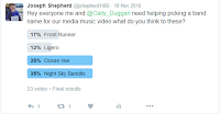 My
partner Caity and I made use of twitters poll tool so we could ask our TA questions and get answers quickly. We used it to get feedback from our TA for example on
band names and how they consumed music.
In
the research stage of our ancillary products, I researched different magazine digipack advertisements to find out what sort of conventions and institutional details
that I needed to put on my advert for the digipack to follow the conventions of digipack adverts. Online,
we found many of these to use through different search engines like google and bing as well as on
the school system that our media teacher had found.
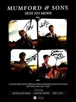 The magazine advertisement that influenced
me the most was Mumford and Sons sigh no more advert , I liked how the images were divided into four sections which made the page look pleasing to the eye aesthetically and the color scheme that was used communicated how this was a band meant for a older TA . I also liked the bold white font that was used
across the page as it created synergy with the rest of the page and made the
overall advert look very organised and well planned. From this advert I also learnt about the amount
of institutional details that needed to be placed on an advert.
As well as creating the music video itself
and the advert for the digipack we also had to create the digipack itself. It was
one of the criteria of the promotion package we had to make, however to do this
we would need a template and we needed a rough idea on what each individual
panel of the digipack needed. I researched digipacks through google to research what each pane needed and to learn the conventions of a digipack.
The tool that helped me to analyse the adverts and digipacks was the presentation software Thinglink, Thinglink allows you to attach pins to an image you uploaded allowing you to annotate it. As I was analysing a still image this software was good to use as it created an interactive experience as well as allowing me to focus on smaller things like serif fonts and larger things like colour schemes at the same time due to the fact that you can put pins in the things you find interesting to analyse.
I feel that Google is probably the most
underestimated technology that I used throughout the research of our products.
Using the search engine google gave us a way of finding out about different artists, and a way of researching
what I did and didn't want to include within my products and it also
enabled me to be able to research and find any information I might need.
Without using google, there are certain software programs
and websites that we wouldn’t have been able to use that are crucial for developing and making my
media products. Especially when it came to using blogger, without google we
wouldn't have been able to present our research and creativity. We would have
needed to find a different platform instead which would of taken away time producing my products
Another piece of technology we used in the
research stage was cameras, we needed to use the camera to see how well our
chosen locations would look on camera by doing principle location photography, as well seeing how well our actors
looked on film. Me and Caity used the camera to get principle photography
around Barton when we went location scouting, so we could see what locations
would look the best on film
One tool I used to present my research was
power point and then I converted into a slide share so I could embed it on blogger.
Using SlideShare allowed me break down my research on a microlevel, to work out
what each part fully meant and represented, whilst presenting my work in a
smart professional looking manner.
In the research stage one tool I used was SoundCloud, I used SoundCloud to upload the recordings of my TA research focus group. I found using the website useful for this as it was an easy way to upload the recording and SoundCloud also allows me to embed it into the blog and play it from there
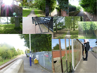 One method I used to present my research was to create a Moodboard, being someone who learns best visually I found this to be especially useful. I used a Moodboard to show my principle location photography this was good as it allowed me to see what colours showed up in each location and from this it helped me to make informed decision on such things like the colours of Katie and Luke's clothing as I wanted to avoid clashing colours.
Another tool that I used during the research stage was Prezi, Prezi is a presentation tool designed to create an animated interesting presentation and using it I was able to highlight my research in key areas, this came especially useful when breaking down my final TA research.
One tool I used during the research stage was Emaze. Emaze serves a similar purpose to SlideShare as it allows you to break down your research and findings onto a really in depth level. Emaze offers more in the form of design templets and tools e.g. the shape tool allowing you to add many different shapes making sure your presentation is very personalised.
Planning
During the planning stage of the project,
the main technology we used was Microsoft word. Within the planning stage we
used Word to create the different pre-production paper work that was needed to
help the shooting process such as call sheets, script breakdowns and risk assessments.
When looking at the pre-production planning paper work we should ask which
pieces where the most useful.
For me they were the storyboards and call
sheets. The story boards provided a visual way of designing and developing the look of our
video meaning how each shot looked, as someone who learns best visually this was immensely useful. The call sheets combined with
the story boards gave us an exact system to follow on our days of filming which
meant that when we shot we filmed efficiently getting it done to a good
standard of shooting
Another technology that we used in the
planning stage was blogger, we used it in similar fashion to how we used it in
planning stage and that was to present our work and findings.
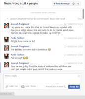 In the planning stage of the music video, me and Caity made use of Facebook as a method of communication. This is because it meant that we could contact everyone quickly with ease in a way that meant that everyone received the same message by creating a “group chat” where we can tall talk at the same time. This was effective as we could actually see when people were receiving the message so we knew our actors were getting the information we sent them.
 In the planning stage of the music video, me and Caity made use of Facebook as a method of communication. This is because it meant that we could contact everyone quickly with ease in a way that meant that everyone received the same message by creating a “group chat” where we can tall talk at the same time. This was effective as we could actually see when people were receiving the message so we knew our actors were getting the information we sent them.
Construction
We used few different pieces of technology
to the construction stage.
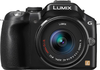 The main technology that me and Caity used were
a camera, a tripod and a memory card. These were the most crucial technologies
that we used during the construction of our product, without these we wouldn't
have been able to film any of our shots to a high quality and would have had to
shoot it on a phone. We used the tripod to help stabilize the camera and make
sure all of the shots looked professional and to the highest quality possible
and the memory card to record our footage.
 The software we used to put our footage
together was editing software known as Final Cut Pro x, I feel that using Final Cut worked extremely well
in terms of firstly allowing us to edit our footage quickly and also being an
easy to understand piece of software with well labelled tools like the blade tool for example which enabled us to shave parts of clips that didn't fit in time to the music. We could work efficiently and make
great use of our time editing due to how well all the tools were labeld and had been explained to us. Secondly the tutorials the software has allowed
us to gain a quick understanding of the tools at our disposal using the
software such as the ability to change the speed of clips, change the colour of clips eg. Slow motion.
These effects allowed us to emphasize certain points or the messages we wanted
communicated to the audience and this was all down to the tools the editing software provided. One of the main tool's I used during the editing stage was Vignette masks as it softened the corners of shots making them look more aesthetically pleasing and less harsh on the eyes.
Another piece of software that we used in
the construction stage was Photoshop Elements 11, this software is a simplified
version of the well-known photoshop software. We used this to help construct
the digipack and the advert for the digipack. We used this software before in AS so
the familiarity we had with it enabled us to work quickly and work to a high
standard as we know which tools to use for certain jobs like adding text.
Evaluation

One of the technologies I used in my evaluation was blogger and cutaways, I used this to answer this question ( question 4) , I choose to do this as I felt it was the best way for me to get my points across and show the journey I had been on from the start of A2 media to now. I feel that one way I could of improved this would of been to actually collect screenshots of me editing the video.
I used Slide share to present question 3, I used this as I felt Slide share was an appropriate tool to break down and present the different research I learnt from my TA on my products to a professional looking standard. Slideshare also allowed me to embed pictures into power points to help me illustrate my research and make the results easier to understand.
I used thing link to answer question 2 as I was able to annotate my ancillary products throught the online presentation tool ThingLink and break them down on a microscopic level part by part eg font. I chose to do this as it was a much simpler way than having to make a power point since I was analyzing a still image, I felt i was also able to go into a great amount of detail because of this.
To answer question 1 I used a mixture of Final cut pro and movie maker to create a directors cut for my music video, this enabled me to break down my music video on a microscopic level and focus on each representation and shot for example. To create one you firstly add freeze frames into your video, blade up the song in final cut pro and afterwards use movie maker to create the audio needed for the commentary.

Saturday, 28 January 2017
Friday, 27 January 2017
Tuesday, 24 January 2017
Original photo
Me and Caity have both agree that since we have named our band "Ocean rise" that we need to incorporate Oceans somehow into our ancillary products. This will be done in the form of a photo however since we do not live anywhere near a sea we will have to use someone else's image, we plan to edit it heavily to make it more of an original work.
Monday, 23 January 2017
A change of idea in the advert
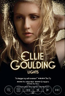 Initially mine and Caity's idea for our advert we had to produce was to use a collage of images of four. We decided to change this for 2 reasons, first of all we weren't able to take enough photo's when we had our actors and afterwards we weren't able to reschedule. We also found that it made the page look cluttered. After doing research we found that a having one large image of the star/stars would work very well and promote the artists very well.
Saturday, 21 January 2017
Draft's of advert
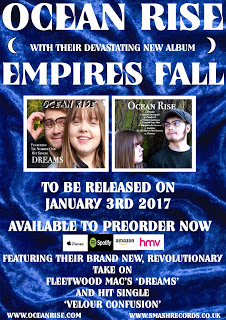 In this draft of our advertisement for our artists, Caity chose a background of blue velvet as one of their singles is called 'Velour Confusion' but our media audience group did not like this background so I will have to change the background again. There was a lot of positive feedback about the text at the bottom as the font was really effective and they liked the use of the logos and the websites at the bottom so the only things we need to change are the background and the use of the word 'devastating' as this wasn't the word I actually meant.
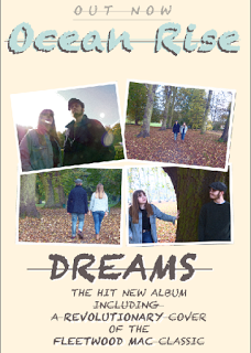 In this draft we focused on trying to find the right colors to use, in this instance we color picked the denim for the name of the band and for the background we used the color picker tool on one of the leaves which was a lighter color, we did initially try one of the golden/burgundy leaves but it was too dark and didn't look as though it would fit our indie genre.
Friday, 20 January 2017
Thursday, 19 January 2017
Research - Final TA research part 6
Q6 – did you like the costumes and locations? Were there any you liked?
This question was important to ask, as if
the viewer found the costumes and locations stale then there was a chance that
they actively or inactively would lose focus and no longer be engaged in the
video
Mine and Caity’s desire with the costumes
was to make them look young and modern so it appeals to our young TA, it would
make Katie and Luke relatable to them.
“I
loved the locations especially the one with the Humber bridge in the background
, however I feel maybe just one fast pace environment could've been featured
when they were arguing to match their moods and it would've pushed the
narrative further.” This comment is interesting as I
feel that adding in a fast pace environment would of really helped further the
dynamic and pushed the narrative further.
“yes
they made the narrative seem more realistic as they were wearing normal
clothing and in calm locations.” This shows that
Mine and Caity’s desires with our costume and location works, it made them seem
like real and genuine people which I feel helped the audience feel sympathetic towards
the characters Katie in particular
“I
liked the returning to locations over periods of time to show the difference in
their relationship while the environment around them was the same. I also liked
the use of the Humber Bridge as the stage for what I presume is the climax. “This Comments shows us that my idea to repeat locations to help show the
different stages in the relationship works and it doesn’t feel like we are over
exposing locations to the viewer
The
costumes weren’t at all incongruous, so much so I had to look at them again for
this question! There is a good dichotomy between Luke’s dark clothing and
Katie’s light denim jacket. If I was to make one change it would be to include
more clothing, so that the time of this relationship felt longer, but I don’t
know if you have the time to do that.” This comment
is useful as the advice is valid and really useful. I feel would of really
improved the product.
Wednesday, 18 January 2017
Saturday, 14 January 2017
Monday, 9 January 2017
Research - Final TA Research part 2
Q2) Were Their
enough close ups of the main artists?
This question was important to ask as due to scheduling conflicts we were not able to get any additional close ups, we had to relay on the ken burns tool to create close ups out of the shots we had and relay on the few close ups we had shot while filming.
Everyone that filled out the survey agreed that there were enough shot's, however we did receive some additional feedback on top of the question that featured suggestion of what we could of tried to make it an overall better product and praise saying we found the right balance.
The feedback
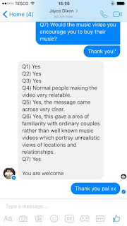 "There were more than enough close-ups of
the artists. If anything, I would say there were maybe too many close/medium
shots. This appeared to be a story about growing distance and loneliness, and
more long shots/negative space would be the easiest way to communicate that
distance." - male, 22
"Again
yeah, it was kind of 50/ 50 with the closure and the more narrative shots so I
think that's bout right." - male 18
"there is a good range of shots overall , my
fave close up was at at 3 mins 30 seconds of the girl as the lyrics and her
expressions fit perfectly and pushes the narrative and I feel anymore close ups
of them both would've made the video look too repetitive" - female 18
" Yes it was very simplistic and focused on the two main characters which made it effective, the close ups were relevant and frequent" - female 17
" Yes there was enough and it was a good balance of shot types " - female 17
Analysis
Overall this feedback was very good, the fact that they don't feel there is a lack of close ups is very good for me and Caity as the lack of close ups was one thing we were concernd about.
Sunday, 8 January 2017
Subscribe to:
Comments (Atom)


